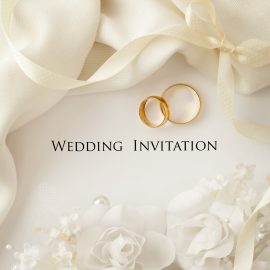
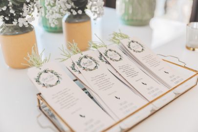
You could spend $3,300 for a set of 150 engraved invitations. That’s not including menu cards, place cards, or thank you cards.
But if you design your own wedding invitations, all you have to do is get them printed for a fraction of the cost.
Of course, even if you are trying to reduce wedding costs, you still want your invitations to look perfect.
Check out more designs for wedding invitations click HERE.
Design Your Own Wedding Invitations with These 9 Awesome Tips
In this post, we’ll give you 10 top tips to design your own wedding invitations like a pro. Read on!
1. Highlight Your Wedding Theme
Before designing the invites, you should know the style of wedding you are going to have. Give your guests a hint so they can be properly prepared.
- A cute backyard wedding with lawn games might tip off the guests to not wear heels that will sink into the grass.
- A barn wedding would be best paired with a rustic theme and relaxed vibe.
- A glam reception, on the other hand, is completely different.
Look for inspiration to find the right look for you. Whatever your theme, show it on your wedding invitation.
2. Show Off Your Colors
Your wedding invitations don’t have to be the exact color of the bridesmaid dresses (unless you really want them to). But it will help your wedding feel cohesive if the invites use your chosen wedding colors.
Ivory, cream, or white cardstock together with a black or gold font is a timeless option for formal wedding invitations. Feel free to brighten your wedding invitations with colorful fonts and paper or envelopes as well as accents such as a floral border.
Just make sure that the text is legible. The most important thing is that guests can read the date, time, and RSVP information.
3. Select The Typefaces Carefully
Choosing the right font is vital when you design wedding invitations. The font must fit with the layout and style of the invitation or it will look jarring and awkward.
A major part of how to design wedding invitations is choosing a good, balanced font. You can’t go wrong with an elegant script for this occasion.
Check out: Cool Dust Transparent Textures for Your Images
Eccentric Fonts
Stay away from eccentric fonts. Some people won’t be able to read them. Plus, you might hate it once they are printed and the novelty of the font has worn off.
4. Consider Using Photographs
Many couples are using photography on their wedding invitations nowadays. A gorgeous photo can make your invitations look modern and fresh while also being totally unique.
You can use a photo of the two of you or a significant location (where you first met, the wedding venue, etc).
5. Align Your Type Centrally
The tried-and-tested rule for wedding invitations is center alignment. This keeps your important document from looking like regular ho-hum mail like flyers.
- No matter what software you use, ensure that all text frames are aligned perfectly in the center.
- Next, divide the text into small chunks to make it look elegant and organized.
- You can also use ribbon banners or flourishes to divide the text as well. For example on top and under the names of the couple
- Feel free to use a variety of weights and sizes.
- It would be a good idea to set the date and time in boldface.
- The name of the couple should be large and could also be in italics.
- Extra info like dress code is fine in a smaller size and a light face.
Check out: Over 35 of the Best T-Shirt Mockup Templates Available for FREE Download
6. Choose Your Words Wisely
There are general rules to wording your invitation. Usually, you will spell everything including the year. However, use an ampersand (&) instead of the word and in between names. It looks so much prettier!
You can be formal or laid-back on your invitations but you should stick to the basic rules because it is what your guests expect. Plus, it can jangle some nerves if the host is not listed first. Parents and grandparents may care about these things more than you.
If you have a wedding planner, consider putting his or her wedding planner logo on your website. You might get a discount or a freebie. If not, at least future brides will thank you!
7. Don’t Crowd the Card
It’s important when wedding card designing not to stick too much text on.
Crowded invites are harder to read and won’t look as polished. Worse, your guest may miss the RSVP deadline or get the wrong start time. Add only the essential information.
Leave the rest like directions, registry, and post-wedding activities for your wedding website, or print them on separate cards to go in the same envelope.
Check out these templates for ideas.
8. Triple-Check the Proof
When you design wedding invitations, it is your job to make sure the proof is error-free. This can be tricky because your eyes may gloss over mistakes since you’ve been looking at the same card for hours.
Print out a test print if possible. That way you will see the weight of the paper and how the colors look once printed. It can look very different than on screen.
Ask your mom, best friend, sister, and fiance to read it for errors. If you have a grammar-savvy bridesmaid, have her check the proof too.
Pay close attention to spelling and the date and time. Do what editors do and read the proof word for word from right to left. That way your eyes will focus on the word you are on not what’s coming next.
Check out: Pretty Letters: 6 Beautiful Fonts Trending In Web Design In 2021
9. Designing the Envelope
Don’t neglect the envelope. Although not technically part of the invitation, it should still complement the wedding invitation inside.
If you are handwriting the addresses or getting a calligrapher, consider printing an elegant swirl in one of the same colors as on the invite.
Make sure to confirm the right envelope size. It should be 1/4 inch larger than the invite to fit. If you have standard-size invitations, it will be easy to get the right envelope.
Conclusion
We hope you are full of ideas and tips to help you feel confident in your ability to design your own wedding invitations.
We’re sure that the money you’ll save on designing your own invites will be better spent somewhere else. Like one the wedding dress or cake.
Follow us on Facebook for free graphic design resources and tips.
Check out our website for more content like this.


